A visual narrative tells a story or conveys information through images, graphics, and other visual elements. It’s a powerful data storytelling tool, allowing complex information to be easily understood and engaging the audience in a more immersive experience.
Various visual narrative genres used in data storytelling include flow charts, magazines, comic strips, and slide shows. Let’s explore each format’s unique advantages and challenges.
Flow Charts
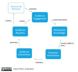
Flow charts are diagrams representing processes or systems, showing the steps as boxes of various kinds and their order by connecting them with arrows. They help visualize the flow of data, decision-making processes, and problem-solving.

Advantages:
-
-
- Easy to understand complex processes
- Clear representation of the sequence of steps
-
Challenges:
-
-
- It can become cluttered when dealing with large amounts of data
- May oversimplify complex processes
-
Magazines
Magazines combine text, images, and graphics to tell a story in a visually appealing format. They are used to present data stories in a journalistic style, with a balance of facts, analysis, and visual aids.
Advantages:
-
-
- Engaging layout and design
- Can present detailed information in a digestible format
-
Challenges:
-
-
- May require significant design resources
- Can be time-consuming to produce
-
Comic Strips
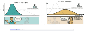
Comic strips use sequential panels of images, often with text, to tell a story. They can make data stories more relatable by incorporating characters and humor.

Advantages:
-
-
- Appeals to a wide audience
- Adds a human element to data storytelling
-
Challenges:
-
-
- Can be challenging to convey complex information
- May be perceived as less serious or professional
-
Slide Shows
Slide shows are a series of visuals displayed on a screen, typically accompanied by a spoken narrative. They are often used for presentations, seminars, and webinars.
Advantages:
-
-
- Easy to create and edit
- Can present a large amount of information in a structured format
-
Challenges:
-
-
- Can become monotonous if not designed well
- Dependent on the quality of the spoken narrative
-
When using these formats, choosing the one that best suits your audience and the data you want to convey is important. For instance, a flow chart might illustrate a decision-making process perfectly. At the same time, a magazine-style layout could be more suitable for presenting a comprehensive analysis of a particular topic.