R and Python—both widely used programming languages favored by data scientists and analysts for the power and flexibility they offer—are additional tools available apart from the built-in analytics capabilities in Power BI. Integrating R and Python with Power BI can elevate your data analysis and visualizations to a whole new level, tapping into the massive libraries and packages available in these languages.
Here are some ways integrating R or Python can help you with advanced analytics in Power BI:
R in Power BI:
R is a programming language focused on statistical computing and graphics. Power BI enables integration with R by using R scripts and visuals. Here’s an example:
Imagine you are working with customer data from your organization’s CRM system, and you want to identify customer segments based on their purchasing patterns. You can utilize clustering algorithms (e.g., K-means) from R to help you segment your customers and visualize them in Power BI.
To do this, first, ensure R is installed on your machine, and then follow these steps:
- In Power BI, go to ‘Home’ > ‘Edit Queries’ > ‘Transform’ > ‘Run R Script’
- Input your R script and click ‘OK’
- Power BI will execute the R script and import the resulting data
Now, you can create visuals in Power BI using your newly created customer segments.
Python in Power BI:
Python is a versatile, general-purpose programming language with powerful data manipulation and analysis libraries. Power BI supports Python scripts and visuals similar to R. For example:
Let’s say you operate a chain of retail stores and want to forecast future sales based on historical sales data. Python’s libraries, like pandas and sci-kit-learn, can make this a breeze.
Here’s how to integrate Python with Power BI:
- Make sure Python is installed on your machine
- In Power BI, go to ‘Home’ > ‘Edit Queries’ > ‘Transform’ > ‘Run Python Script’
- Input your Python script and click ‘OK’
- Power BI will execute the Python script and import the resulting data
Now, you can create visuals in Power BI to display your projected sales.
Creating custom visuals using R and Python:
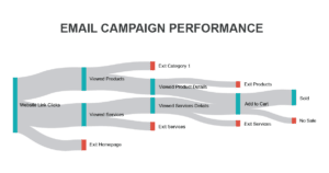
Apart from data transformation and analysis, you can also create unique, custom visuals using R and Python. Suppose you want to showcase email campaign performance using a more advanced visual like a Sankey diagram, which is not available in the standard Power BI package. You can create custom R or Python visuals to represent your data in this format.

To create a custom visual using R or Python, follow these steps:
- In Power BI, go to ‘Home’ > ‘Visualizations’ > click on the “three dots” > ‘Get more visuals’
- Search for “R” or “Python” and click on the respective visual to add it to your workspace
- Select the R or Python visual and input your script in the ‘Script Editor’ pane
- Set up the data fields and click on the ‘Run Script’ button to execute and display your visual
Integrating R and Python in Power BI enables you to unleash the power of advanced analytics and create beautiful, interactive, and insightful visualizations. By leveraging the capabilities of these powerful languages, you can provide even greater value to your organization through data-driven decision-making.