Why Use a Scatterplot to Explore Correlation?
A scatterplot is a graphical tool that displays the relationship between two variables. It’s like a map 🗺️ that helps us see where different variables are located.
A scatterplot conveys much more information than a single correlation coefficient because it shows us the actual data points and the relationship pattern. A correlation coefficient only tells us the strength and direction of the linear relationship between two variables.
📈 For example, let’s say we’re studying the relationship between the amount of time students spend studying and their grades. A scatterplot can show us how the data points are spread out and if there are any outliers, while a correlation coefficient only tells us if there is a linear relationship and how strong it is.
How Do Different Correlation Coefficient Values Correspond to What We See in a Scatterplot?

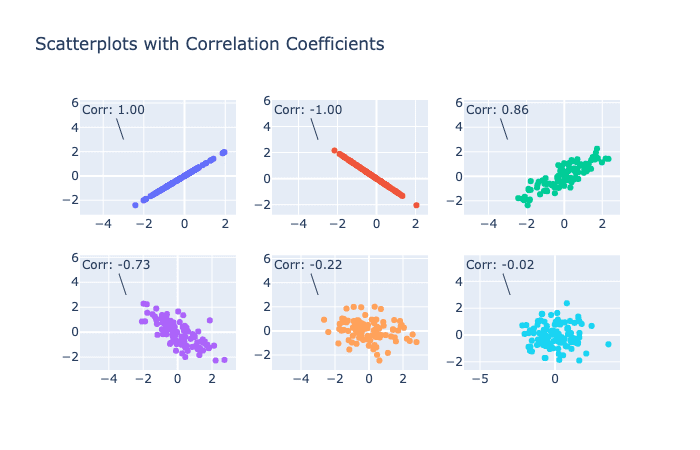
- A correlation coefficient of 1 or -1 means there is a perfect linear relationship between two variables. This will be shown in a scatterplot by a straight line that goes through all the data points.
- A correlation coefficient of 0 means there is no linear relationship between two variables. This will be shown in a scatterplot by a random scatter of data points.
- A correlation coefficient between 0 and 1 (or -1) means there is a linear relationship between two variables, but it may not be perfect. This will be shown in a scatterplot by a general trend in the data points but with some variability and outliers.
📊 Understanding the relationship between correlation coefficient values and scatterplots can help us interpret our data correctly and avoid making incorrect conclusions. So next time you’re analyzing data, think like an explorer and use a scatterplot to navigate the patterns in your data! 🧭🗺️