Hey guys! It’s Chip, and I’m here to talk about histograms and density plots! 📈
Histograms and density plots are great ways to explore the shape, skew, and modality of a distribution. They can help us to understand how spread out the data is and if it’s evenly distributed or skewed to one side.
📊 Histograms: A histogram is a way to display data using bars that show how many times each value appears. The bars are grouped into bins, which represent a range of values. The height of each bar represents the frequency of values in that bin.
So, how can we use histograms to explore the shape, skew, and modality of a distribution?
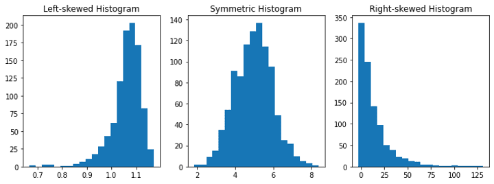
🔍 Shape: The shape of a histogram can give us clues about the distribution of the data. If the histogram is symmetric, it means that the data is evenly distributed. If it’s skewed to the right, it means that there are more values on the left side, and the tail is longer on the right side. If it’s skewed to the left, it means that there are more values on the right side, and the tail is longer on the left side.

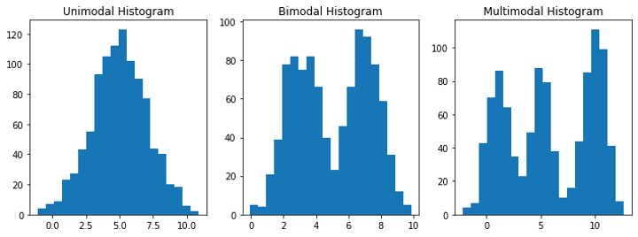
🔍 Modality: The modality of a distribution refers to the number of peaks in the data. A distribution can be unimodal (one peak), bimodal (two peaks), or multimodal (more than two peaks). We can see the number of peaks in the histogram by looking at how many bars are taller than the rest.

📈 Density plots: A density plot is a smooth curve that shows the distribution of data. It can be thought of as a smoothed-out version of a histogram.

So, how can we use density plots to explore the shape, skew, and modality of a distribution?
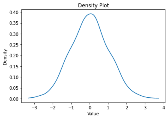
🔍 Shape and modality: The shape of a density plot can give us clues about the distribution of the data, just like a histogram. A symmetric density plot means that the data is evenly distributed, while a skewed density plot indicates that the data is not evenly distributed. The modality of distribution can also be seen in the number of peaks in the density plot.
🌡️ Normality: Finally, density plots can help us to determine how normal (symmetric) a distribution is. A normal distribution is evenly distributed and has a single peak in the center. If the density plot is symmetric and has a single peak, it’s likely that the data follows a normal distribution.
So, there you have it! Histograms and density plots can be powerful tools for exploring the shape, skew, modality, and normality of a distribution. Next time you’re analyzing data, give them a try! 🧐