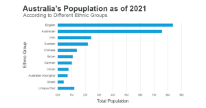
Typography plays a crucial role in ensuring that your data visualization is clear, legible, and easy to understand. Here are some techniques and examples that will help you improve the readability of your charts.
1) Choose an easily readable typeface: When selecting one, prioritize readability. Sans-serif fonts such as Arial, Helvetica, or Open Sans are an excellent choice in most cases, as they remain legible even in small sizes. Try to avoid typefaces with decorative or thin strokes, as they can be difficult to read.
2) Ensure a proper font size: Font size is crucial to ensure readability. As a rule of thumb, use at least a 10-12 point font for the main text, 14-16 points for headings, and 9-10 points for labels and captions. Always check your chart on different devices and screen sizes to ensure the text is legible.
3) Limit the number of typefaces: Using too many typefaces can create visual clutter and make your chart difficult to read. Stick to one or two typefaces, and use variations in weight and style (like bold or italic) to create hierarchy and differentiation.
- Example: Use the same sans-serif font for axis labels, data labels, and chart titles but apply different weights to distinguish them – bold for the title, regular for axis labels, and light for data labels.
4) Prioritize hierarchy and consistency: Organize and prioritize information through typography so the viewer can easily understand the relationships between different elements in the chart. Use font sizes, weights, and colors to create a clear hierarchy and maintain consistency across all charts in your presentation.
- Example: If you’ve chosen Arial as your font with bold for titles in one chart, ensure that all other charts also use Arial bold for titles.
5) Use color and contrast wisely: Color is an important aspect of typography and can help you emphasize certain elements and make the text more readable. Ensure enough contrast between the text and the background color, and use colors that don’t strain the eyes.
6) Align elements for clarity: Ensure that your text elements align consistently with one another, making your visualization look cleaner and more organized. This applies to axis labels, data labels, chart titles, and legends.
7) Keep it simple: Eliminate unnecessary elements that may clutter the design and make it difficult to read. Only include text that’s essential to understand the chart, and use spacing and layout to create clarity.
