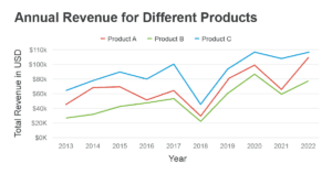
Typography is a crucial aspect of any data visualization or chart design. It can make or break the effectiveness of your visuals in conveying the intended message. Here are some guidelines when it comes to chart typography:
- Choose the right typeface: The typeface you select should be legible, versatile, and suitable for data visualization. Some great examples include Helvetica, Arial, and Roboto. These sans-serif fonts are easy to read and work well in various sizes and screen resolutions.
- Be mindful of font-size: The size of your type should be easily readable, neither too small nor too large. As a general rule of thumb, the minimum font size for a chart should be around 10-12 points. For a title, use a larger size, such as 16-18 points, to make it stand out.
- Limit the number of typefaces: Using multiple fonts can make your chart cluttered and difficult to digest. Stick to one or two typefaces at most: one for headings and labels and the other for body text or data. Ensure they are visually compatible and complement each other.
- Use hierarchy to organize information: This means prioritizing information based on its importance. For example, titles should be in a larger or bolder font, then axis labels, followed by data labels, and finally, legends in the smallest or lightest font.
- Contrast and legibility: Make sure there’s a good contrast between your text and background colors. Black text on a white background is usually the most legible. However, you can also selectively use contrasting colors to draw attention to specific data points or areas in your chart.
- Align text properly: In most cases, labels should be horizontally centered and vertically aligned with the data. However, for some charts like bar charts, you can align the text to the left or right of the bar to improve readability.
- Use text as a design element: Text can also be part of your visual design. For example, in a waffle chart, you can use large, bold numbers to both depict the data and act as a design element.
- Optimize text for mobile devices: If you know your chart will be viewed on smaller screens, optimize the text size, spacing, and typeface accordingly. Keep in mind that some fonts may not display correctly on all devices, so test your visualization to ensure it is mobile-friendly.

In conclusion, well-designed typography can greatly enhance your data visualization by making it more visually appealing, easily understandable, and accessible to a wider audience. Do not forget to keep it simple and prioritize the readability and hierarchy of the text content in your chart.